
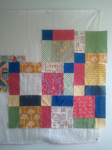
My commissioned quilt is NOT going well.
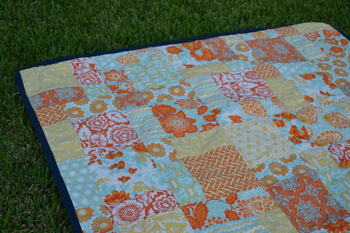
The client chose the disappearing nine-patch based on the above quilt, which resides on my couch. I tried to explain that it wouldn't look exactly the same because there would be a wider variety of colors in the quilt I was making for him. He was adamant, and so I pressed onwards.
 |
| I think I'm going to replace the Echo...it just doesn't fit the vibe... |
And I still hate it. Seriously. It's BAD. Like, please don't comment and say it's not, because it is. I don't feel bad about posting about it because it's nice to know that people slip up every now and then. That's what this is. My fabric pull was great...it all looked awesome in a stack. Now that I'm cutting and sewing, not so much.
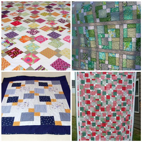 |
| 1. Joel Dewberry Heirloom Quilt Top, 2. Wedding quilt - bound!, 3. Disappearing nine patch for mum, 4. Happy Holly Days - Jan2010 |
So I was looking at how I could alter the layout of the disappearing nine-patch, and came up with some examples that might lend themselves better to the fabrics that I have to work with. It was suggested on Flickr that I need larger solid areas for the eyes to rest. I agree, and I'd love to work in some more cream-colored and neutral fabrics. The only problem that I'm working with now is that I can't buy any fabric, I have to work entirely with what I had. It's a little bit of a challenge.
It's my personal opinion that most bloggers out there don't show things that go bad. Sure, quilting lines might be wobbly, or there might be a pucker in the finished quilt, but I can't remember the last time I saw a post where a quilter admitted that "Wow, I thought this fabric pull looked great at first but when I started sewing it was just awful."
'Atta girl, showing how it is! It happens. I haven't screwed up a quilt yet, but I had a pretty disastrous attempt at an oven mitt. I'm sure it's just a matter of time before I have a quilt disaster!
ReplyDeleteI agree that you need more space. Do you have any solids on hand, or just little bits of them? White would probably clear things up, but a red or a navy might work as well, depending on what layout you went with (I could see the design on the top right working well with a darker color.) I don't know that the "Holly Days" layout would gain you much--I think that would still seem too busy with the fabrics you have.
Good luck! Thanks again for the honesty, and I'm sure you'll figure something out! Quilters are crafty, creative types, are we not? :)
Also! Going through the blogs on my reader, the very next one above yours was from "Throw A Wench in the Works" bemoaning her "Fugly Quilt." Check it out, and commiserate. :)
ReplyDeletehttp://throwawenchintheworks.blogspot.com/2012/09/its-just-fugly.html
Hello Rebecca, I just made a Dissappearing Nine Patch also. As I like things orderly I only had two colors in a block and did not mix up the blocks but just combined the block with itself. Rather than an all over pattern there are distinct color groupings giving lovely diagonals.
ReplyDeleteI don't often see mishaps either, but "Throw a Wrench in the Works" just posted one, too! I was going to say to add more solid, also, like the first quilt in the mosaic with the white. I have a quilt I really hate even though the fabrics are each pretty. They just don't work at all in the quilt. Learning experience!
ReplyDeleteI was just going to post to say that she'd posted one, too!
DeleteI think for me, the blue solid is what bugs me, as it doesn't seem like the same tone as the rest of the choices.
I'm agreeing with replacing the echo - its too bold of a print for these.. as for layout.. you're right, its just not there but i'm not sure how it could be altered either.. its hard because some of the colors are more muted (like the greens) whereas the blues are so concentrated that they stand out more.. ah, I wish I was there in person to help, its so hard on the computer.. I have faith in you though, you'll make it work - What are you using for the backing, can you take some of that and use it to break up the blocks and then maybe add a strip of blocks to the backing to make up lost space?
ReplyDeleteCommiserations. I don't blog enough, that's why you don't see mine ;) Can you use any of the fabrics on the reverse side? This might give you more colour options without purchasing any more fabric.
ReplyDeleteI agree with Pam, if you organize each block within itself it may cut down on the chaos and give the quilt some more focus. Good luck.
ReplyDelete